After many sketches, revisions and tweaks, I had a logo I was happy with and was eager to start using it on all of the different marketing materials I needed, such as business cards and my website.
However, before I could get started on all of those things, I had to set some ground rules, or in this case, design rules. These design rules came in the form of creating a visual identity system.
A visual identity system is a set of design rules and guidelines in which a logo and its related design aspects are to be used to visually represent an entity.
I needed to create this visual identity system not only for my own sanity but to make sure that every piece of marketing material I designed in the future and every piece that my logo will appear was all cohesive and on-brand. I spent a lot of time developing my logo, so I wanted to make sure the environment in which it would be was designed as well.
The start of the visual identity system
In starting my visual identity system, I wanted to make sure I defined specific things such as the exact colors to be used, what typefaces were appropriate, and how to use and how not to use the logo.
A couple of those pieces of information were fairly straightforward, as I had established them in the logo design portion already. The colors would be blue and green and the main typeface would be Philosopher.
Colors
Starting with defining the colors, I developed a four-color system for my visual identity that I would use throughout any design piece I would create. These colors would be blue and green for the main colors, and dark gray and light gray for the secondary colors. The secondary colors would be used to support any other design elements that I felt weren’t as important as anything you would see in blue or green.
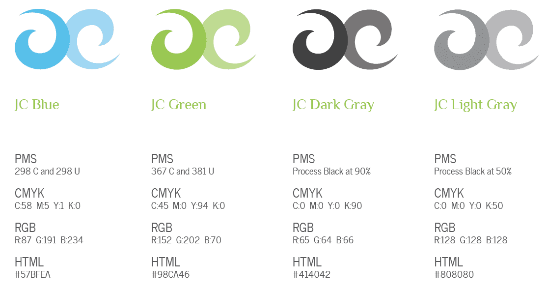
You can see here that I defined the specific color of each of the four and gave them simple names in which I can use in other places: JC Blue, JC Green, JC Dark Gray, and JC Light Gray (JC, of course, being the initials for January Creative).
Each color was then assigned a specific PMS (Pantone Matching System) color used for printing. The CMYK (cyan, magenta, yellow, and black) colors were determined as a secondary option for representing the colors if PMS colors were not available.
For digital use of the colors, RGB (red, green, blue) and HTML (hypertext markup language) colors represent the exact colors on digital monitors and on the web. With these values, I know that now any time I want my JC Blue color represented somewhere, I can ensure the color matches as closely as possible to all of my other materials both print and web.
Typography
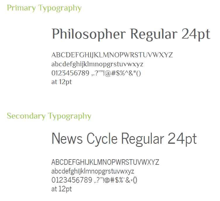
Since I had already defined that the type in the January Creative logo would be Philosopher, I needed to also define a secondary typeface that would pair nicely with Philosopher but also flowed well with the new logo design.
Philosopher was chosen as the primary typeface that would be used for any and all headings and other important pieces of information represented in my marketing materials.
Philosopher was often going to be represented in either blue or green depending on its use. The bold version of Philosopher is what is seen in the January Creative logo.
News Cycle was chosen to go with Philosopher and mainly used as the body typeface and for secondary information. It is very easy to read, very clean and could sit with Philosopher as a compliment but can still hold its own.
News Cycle would mostly be used in a gray version and rarely would be used with the blue or green color.
They flow well together and compliment each other. They also make a great match when designing marketing materials and help keep with the overall look and feel I was going for. So far they make a great pair as you can see on this site!
Do’s and Don’ts
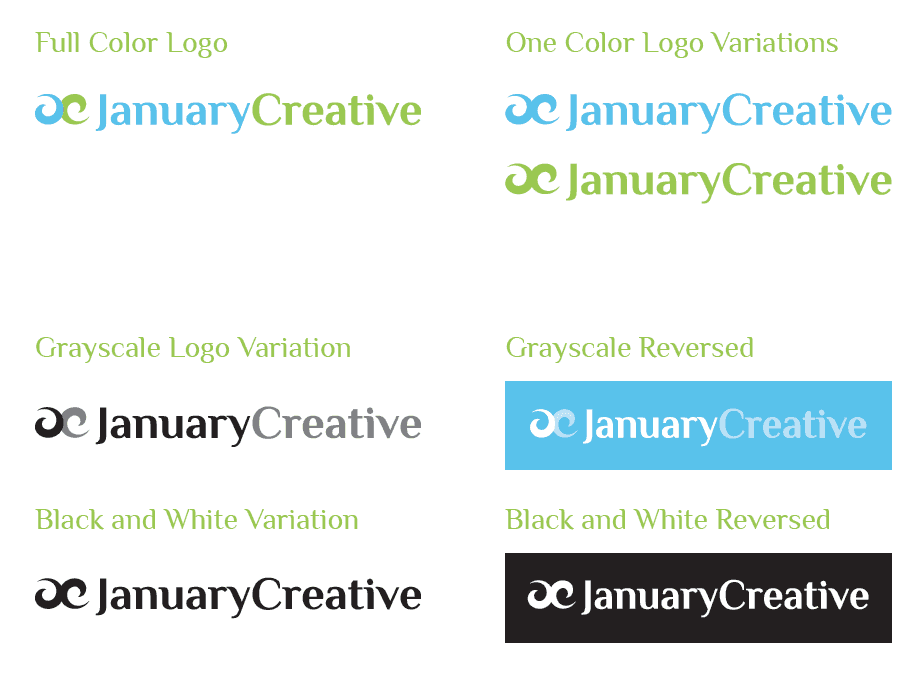
I needed to also establish some ground rules as to how my logo could be manipulated. While I would always want my logo to be in full color with the blue and green, I do realize that there are some practical moments where that isn’t feasible, such as printing in black and white or wanting to print it on a red background for instance.
Therefore, I established how to use the logo and how not to use it. First, you see how the logo is to be used in different variations, including full color, one color, grayscale, and grayscale reversed.
The full-color logo would be used everywhere and as the primary way to represent January Creative. If necessary, the one color logo option would be secondary.
There are times as well that I may need to use my logo but the color versions will simply look terrible or otherwise won’t work. Therefore the grayscale version will work in places where color would be too much or when the only option would be to remove color (such as in printing in black and white).
There are other times where the logo may need to be placed on a background other than white, be it solid or textured. The two variations show a grayscale version that can be used on a solid background, and a full black and white version would be used on textured backgrounds such as an image.
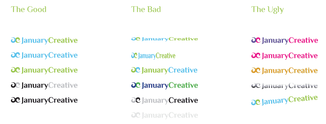
Now that I defined the appropriate ways in which I wanted the logo to be represented, next, I defined how the logo should not be treated. I didn’t want to mess up the new logo or have it represented in a way that could be harmful to my visual identity or brand, so I wanted to outline what should and shouldn’t be done in terms of using my logo.
For the good uses, I reiterated the ways in which are ok to use the logo. The bad and the ugly are ways in which are a no-no.
The bad variations show different bad treatments, such as squishing the logo either horizontally or vertically, reversing the colors (so that the green is first and blue is second), using different color blues and greens, reversing the grayscale colors (so that the light color was first then the black), or having a logo represented in a tint of gray that made it extremely hard to see.
For the ugly, these are just plain terrible ways to treat my logo, such as using colors that aren’t even in the visual identity (such as purple and pink), using a solid color that has nothing to do with my visual identity, using a gradient for the logo in any way, and turning the logo (rotate) in a way in which wasn’t horizontal or vertical.
These rules helped outline exactly how the new January Creative logo was to be used and what not to do when creating different marketing pieces.
Creating the visual identity style guide
I now had all of the visual identity system figured out and written down, so I was armed with the design rules I needed to create things such as my business cards and my website (the two most important things I needed on this new endeavor).
With these things complete, I needed to create a reference guide that I could pull out any time I needed to reference a color number or show others who may be using my logo, such as printers or someone needing to use my logo for a promotion.
This is where my visual identity style guide came into existence. This was actually my very first piece designed for January Creative, even before my business cards and this website!
A visual identity style guide is a reference book in which outlines all of the design rules and aspects needed to carry out design work using an entity’s logo and visual identity system.
You can browse through the PDF version of January Creative’s style guide, designed like a book and currently laid out in spreads (imagine that the center of the PDF is down the center of an open book). All of the images you see above was taken directly from the style guide I designed and produced based on these design rules and guidelines outlined above.
On to the next
With my business name established, business defined, logo designed, and visual identity system developed, it feels great to finally have my business in place to start promoting and building the business. From here I designed my business cards and this website! Everything has come together and it is time to celebrate by using these things and marketing myself for new clients!


