Manuel Bernhardt was looking for a new professional look to both his logo and his website. Previously, Manuel was using a type-based logo, but wanted something a bit more unique while keeping it simple so that he could use it not only on his website, but on other sites as well to promote his work. From there, he wanted to take his new brand identity and refresh his current website to match the brand identity along with general design tweaks and an overall better functioning website.
When we started out working on Manuels’ logos, we needed to narrow down the main focus of what he wanted his brand identity to communicate. We determined his brand drivers would be structured, dynamic, and reliable, as those closely matched the type of work he was doing with reactive and distributed systems.
Once the brand drivers were in place, I got to work on creating two logo concepts for him. The logos needed to represent visually the distributed systems he creates and works on. In addition, he wanted to drop the current red color he was using in favor of more professional colors. He wanted to see gray, blue, and green as options for color schemes.
In the end, Manuel went with the top logo, as that best fit his needs throughout all the uses for his logo. He was able to use his full logo (as seen here), a stacked version (where his name would be stacked and the icon would be on the left side), or just his icon alone in any type of environment he needed.
Manuel only wanted a minor change to his logo icon from the one he selected above. After that change was completed, it was time to get to work on his brand identity style guide. To the right, you see his final logo icon in various color options. It’s important to have a logo that works well with all of your brand colors, which is evident here in the logo icon created for Manuel.
You can see the four main color variations of his logo icon that he could use and still keep brand consistency. The top left is his “official” logo icon, while the other three are still supportive of his brand and can be used as well.
Not only did I show Manuel the different ways he could color his new logo icon, I also included all of the color codes he needs to use his logo in various formats, such as print, screen, and web. To the left, you can see all of his official brand colors, along with his Pantone (PMS) color codes for spot printing, CMYK (cyan, magenta, yellow, and black) color codes for four-color printing, RGB (red, green, blue) color codes for screens, and finally the CSS (cascading style sheets, used in web development) codes so that he can use the same colors on his website and any other place on the web.
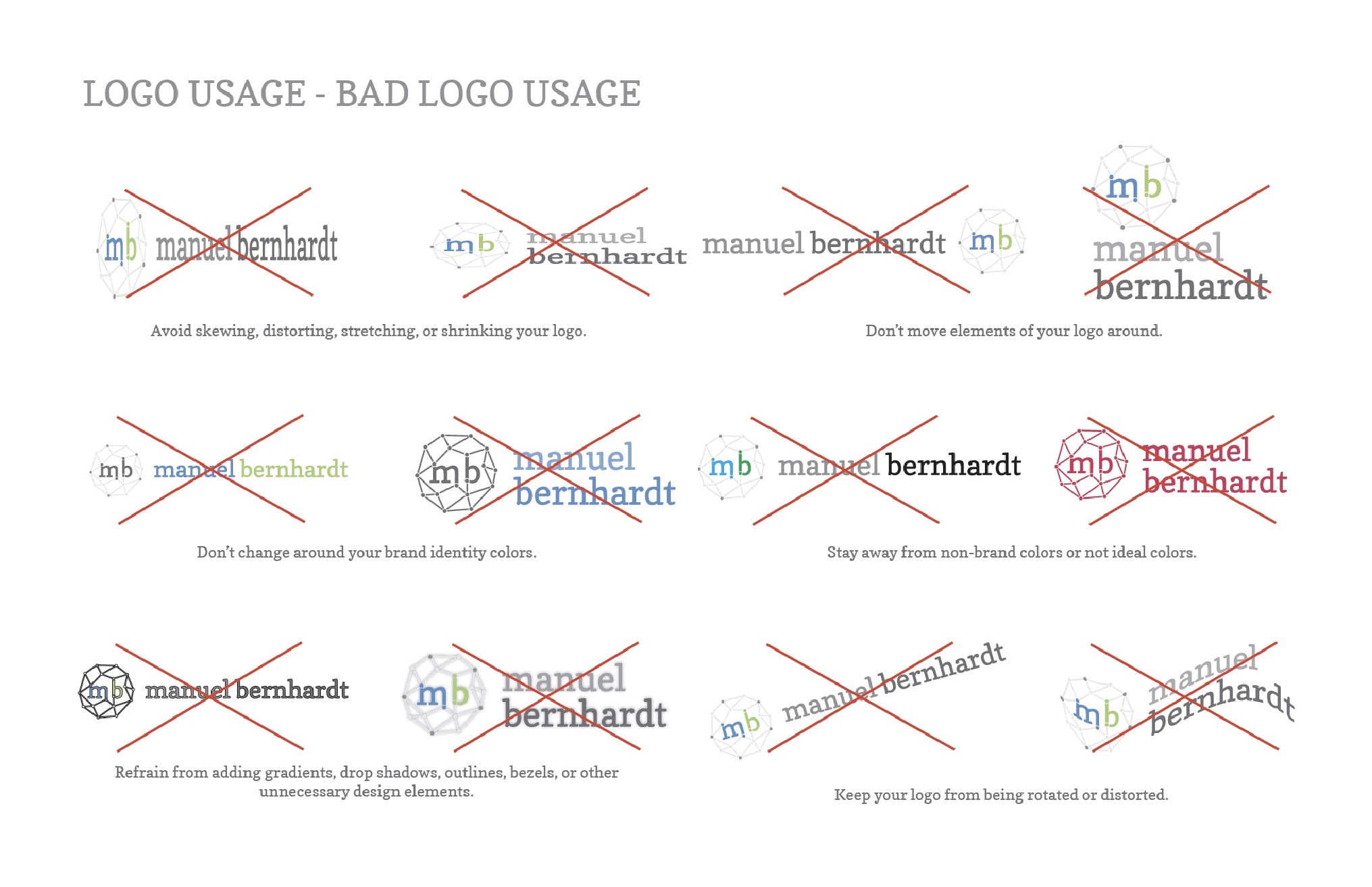
To complete his brand identity style guide, I also included an example of how not to use his logo. This is often important for clients to see the different ways in which their logo doesn’t look the best, by outlining the most common design mistakes that clients often do to their newly designed logos. In the image on the right, you can see all of the ways in which Manuel (and those who work with his logo) shouldn’t present his logo.
The examples such as moving colors and/or elements around, adding a drop shadow, using non-brand colors, or otherwise distorting the logo make your logo inconsistent with the rest of your brand identity, and actually can weaken your brand identity over time. Manuel now has examples of things he shouldn’t do to his logo to help keep his brand identity in tact and professional no matter where he uses his new logo and brand identity.
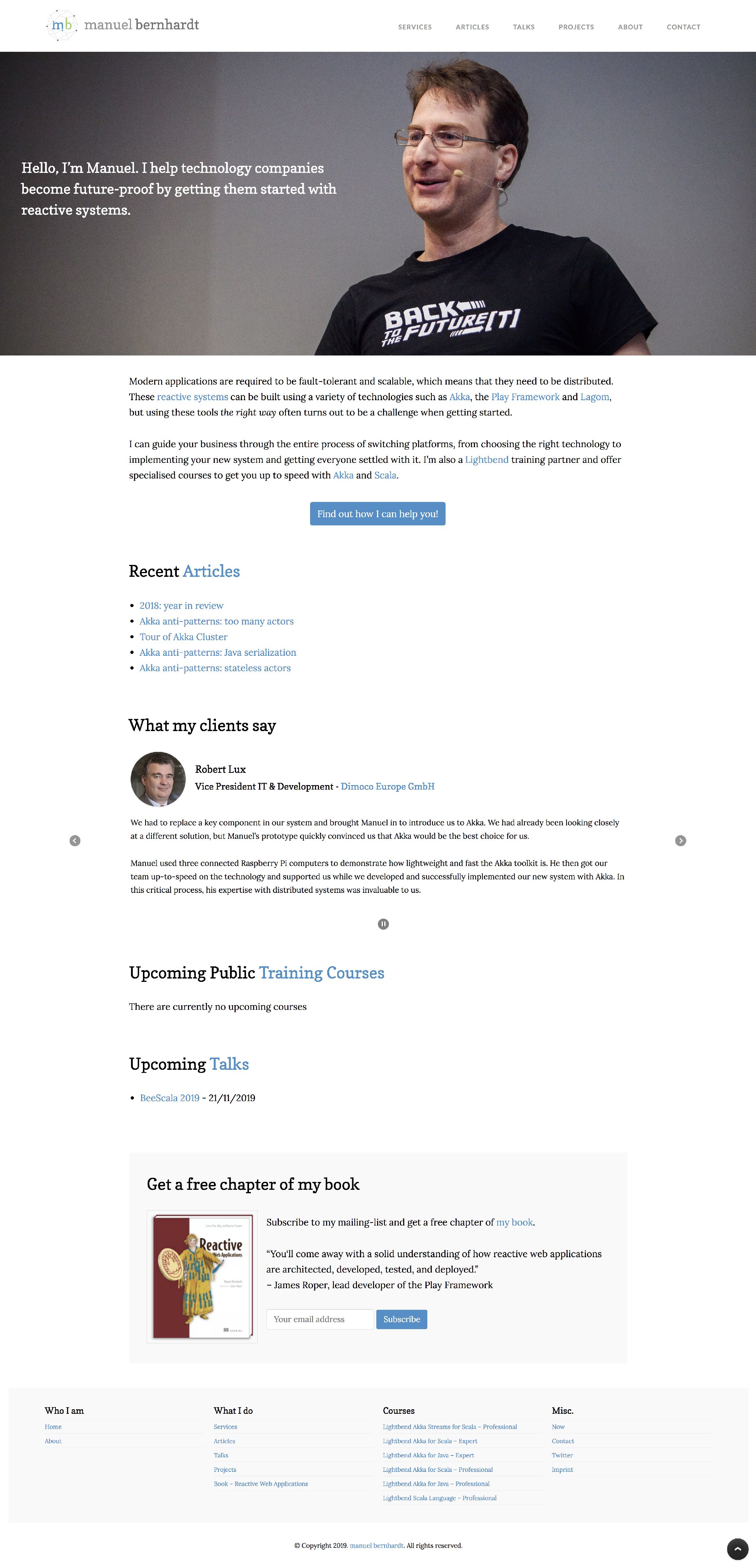
With his new brand identity, it was time to apply it to his current website. I went through and updated his logo, brand colors, typography, and made some design tweaks throughout to help make everything more consistent.
While those changes are what visitors see when they come to the site, the bulk of the work happened on the back-end of his website. Manuel desperately wanted the ability to fully edit and customize his site no matter what his need, and the current pre-built WordPress theme was just not cutting it for him.
With the design tweaks above, I recoded his site completely from scratch using WordPress. He now has a custom WordPress theme that gives him the functionality and ability to customize parts of his website, such as the content blocks on his home page, special layouts for his courses, and adding testimonials and talks in one place on his site and use them in several places (so he doesn’t have to update several different places).
Manuel now has a fresh and clean brand identity and a well-functioning website to match, that allows him to make the content changes he needs to quickly and easily. His website now does the heavy lifting for him, while his logo and brand identity make him look good.