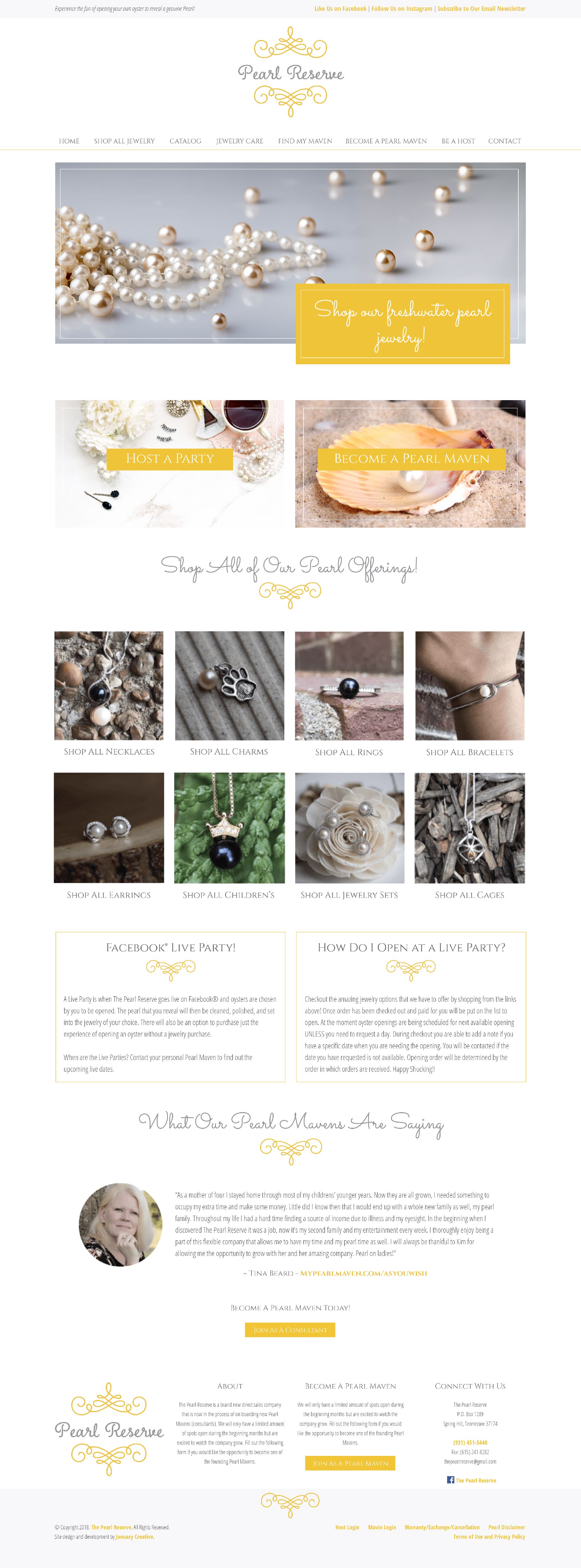
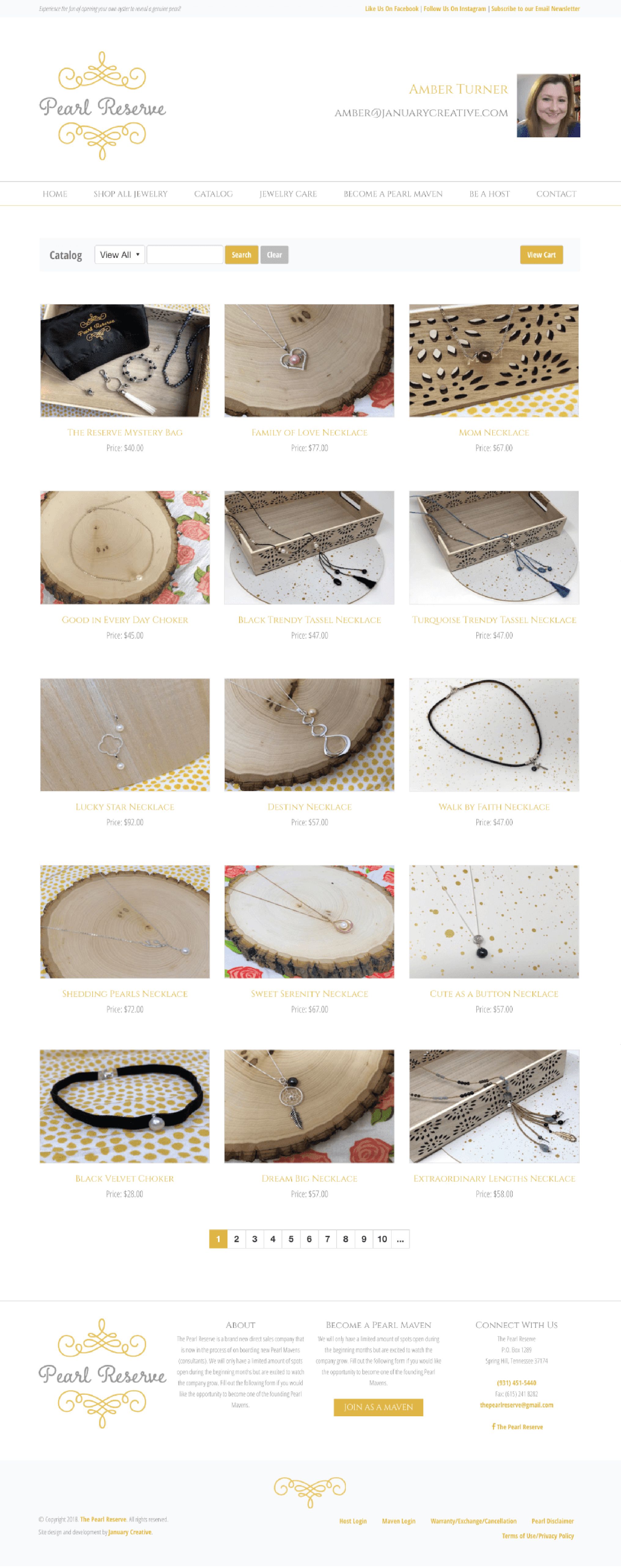
I worked with Kimberly LeCroy, owner of The Pearl Reserve, to make some much needed improvements to her website. What started as simple changes to her website turned into a complete redesign of her site from top to bottom. The redesign helped her have a better presentation for her products, and set her up for growth as she started growing her new company.
- Kimberly LeCroy - The Pearl Reserve (Spring Hill, Tennessee)
After getting to know more about Kimberly and her new thriving company, the design of her website became central to her overall needs and wishes for the site.
Even though we had several issues to work through in terms of making the site user friendly and operating on a stable code base, the design for her website was one that needed to be inviting, bright, sophisticated, and a step above her competitors.
The approach to her identity and design aesthetic focused on these main brand drivers: sophisticated, clean, upscale, and beautiful.
Using her existing brand identity, including her logo and brand colors, I worked the design of the site that focused on usability first, followed by a sophisticated, upscale look.
Using a mostly white design, thin lines, script and serif fonts, along with repeating elements of her logo to achieve her brand drivers, Kimberly was thrilled with the outcome and the potential the new design had to help her take her new company to greater heights.
Every website is different, and it was important to review the specifics of Kimberly’s site to make sure during the design and development process that we didn’t miss the most important aspects of her site.
Aspects such as having a website work well on mobile devices was key, as up to 80% of the traffic to her site was on mobile devices.
Other aspects that needed to be addressed included a better, more organized home page, more expanded content throughout her site, and making sure that everything functioned as intended.
During the website evaluation phase, I discovered that her checkout process wasn’t the most user friendly.
Redirects were taking customers to unexpected pages, things were organized in an unfamiliar fashion, and it didn’t feel like the rest of her site (which could potentially cause customers to back out of purchasing for fear the site may not be secure).
All of these aspects and more were addressed in her new site design.
A more organized home page, functionality that actually worked, and no more unexpected cart experiences.