
So why did it take me so long and so many names before I landed on the name “January Creative?” And why did I decide that “January Creative” was the best name?
It’s all about the name
I already had a business definition. I already knew what services I was going to offer. Heck, I even knew pretty much what colors I wanted to use in the logo (I am a designer, after all), but I couldn’t move forward with any of that without a business name.
I came up with so many different combinations of names. I did what everyone suggested: take things you love and the things you want to do and combine them. So while there are many things that I love and I obviously do a lot of things in my freelancing, I came up with combinations of names that included flowers, colors, shapes, design terms, etc. I went from very small things (i.e. pixels) to very large things (i.e. Milky Way).
I really liked the ending “Creative” so I pretty much stuck to anything that sounded good before “Creative.” But I did try a few combinations with the ending “Design.” I just felt like the ending of “Creative” sounded so much more sophisticated, and it allowed me to expand my business into anything creative into the future.
So with my combination of words and the ending “Creative” I came up with over 50 documented names, including:
- Blissful Creative
- Color Creative
- Sapphire Mist Creative
- Blue Orchid Creative
- Purple Orchid Creative
- January Creative
- Perfect Pixel Creative
- Milky Way Creative
- Beyond Creative
- Blue Sky Creative
And so many more. After careful consideration of each name, I slowly started marking through the names of those that I didn’t think fit the bill. One thing that helped tremendously with this process was checking to see if the domain name, Twitter Name, etc. was available. If those names weren’t available, then it was going to be extremely difficult to start a business around that name.
If the domain name was not available, it was immediately crossed off the list. As you can imagine that eliminated 75% of the available names. The other 25% went off of how I felt about the name if I could market myself with that name, and other factors.
Why did I choose January Creative, out of the 50+ names? Some of the good things about the name January Creative included:
- Available domain names and Twitter handles.
- Gave a feeling of fresh beginnings.
- It wasn’t too long or hard to pronounce and/or spell.
- Left the design possibilities and marketing possibilities wide open.
- There were no preconceived notions about it except what came with the month of January (i.e. new year resolutions).
- Was not dependent on one specific color (except for garnet, January’s birthstone, but how many people remember that?).
- Just so happens to be the same month I was born.
Sounds like some really great reasons, huh? Well, there were also some negative factors too, such as:
- The feeling of winter and snow being “cold."
- Wasn’t very descriptive in the type of services I offered.
- Provided a challenge in creating a logo.
- Some similar domain names were taken.
- There is a local advertising company who uses the name “January” (but has dropped down to using initials for their business name).
All in all, after many discussions with my boyfriend, friends, family, and other freelancers, it seemed as though the winner was January Creative. Now the only challenge was to come up with a logo for it.
Putting a logo with the name
Now that I have my fancy new name picked out, it was time to dress it up with a logo and visual identity design. It is pretty obvious to see what the outcome of this process was, but what other concepts and ideas did I come up with before landing on the one you see all over this website.
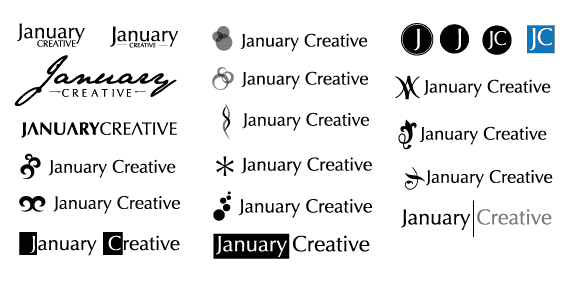
In this image, you can see some of the better logo concepts that I came up with for January Creative, but none of them fit just right. It is safe to say that while I came up with a minimum of 50 business names, as a designer I came up with a minimum of 100 logo concepts.
Ever heard of the concept of designers can’t design for themselves? That is very much true for me, especially in designing the January Creative logo.
As you can see in the image, I started hitting around the “swirl” idea, after doing some research on what symbols are mostly associated with “fresh starts” and “new beginnings.”
This symbol kept popping up and I loved how simple it was. After playing with a few layouts and tweaking it ever so slightly, I came up with the combination you see in the logo today. Not only was the layout very pleasing to the eye, but it also secretly formed the initials J and C. Very clever huh?
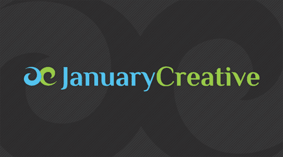
So for the typeface(s), I wanted to use for January Creative, I wanted them to be very strong, elegant, and professional. I first started out with Optima, which is the typeface I had been wanting to use for the new business for many months, way before the name January Creative was even conceived. Try after try, I just could not get it to work the way I wanted to.
After hours of searching and testing different font combinations (well, maybe days), I finally felt that the combination of Philosopher for the main typeface and News Cycle for the secondary typeface would be the best combination.
What happens next?
As you can probably guess, once the logo was finalized for January Creative and everything was finalized, it was time to start developing the visual identity, or the way January Creative would look, including colors, how colors would be used, etc. I even summed it all up into a visual identity style guide, all of which I will talk about in the next part of this series.