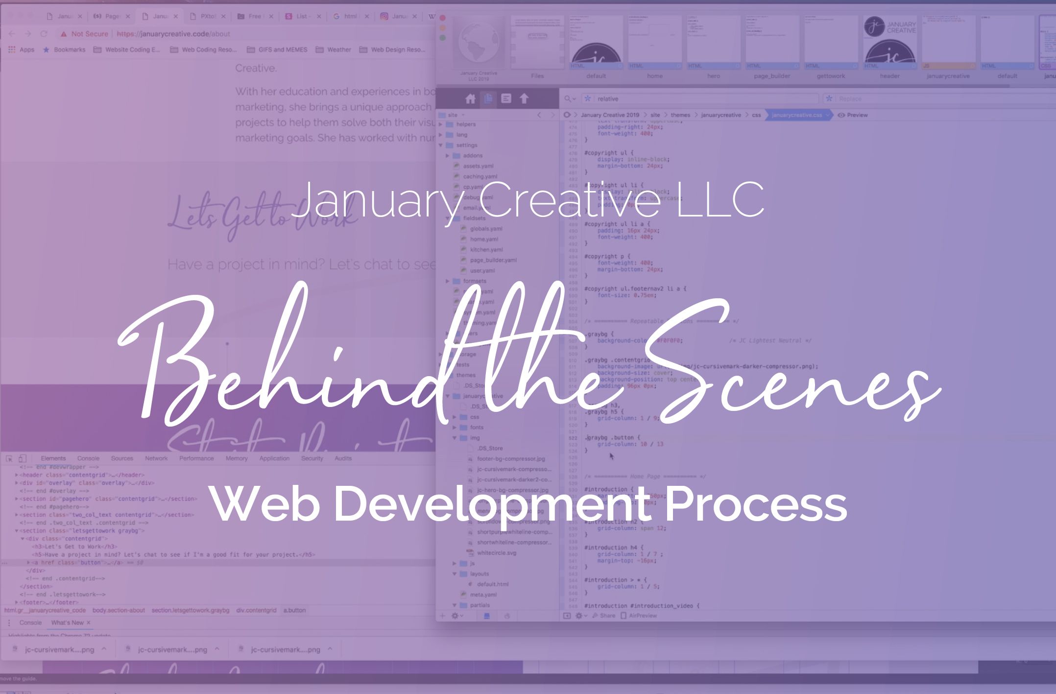
In my last article, I took you behind the scenes of the planning process that it took for rebranding my design firm January Creative LLC. Today, you'll get to keep your backstage pass as we look at the color + typography exploration and logo design phase of the rebrand. Just like yesterday as well, I screen recorded my entire process! You can see the time-lapse video of the color + typography exploration and logo design process in the video at the end of the article.
The most important part of the rebranding process
Arguably, the most important part of my entire rebranding process was making sure I get the brand identity correct, including the logo, colors, and typography.
Getting the brand identity right would make everything else that comes after it easier and much more effective.
I spent a considerable amount of time in this phase because I wanted to make sure I get it just right. You may have heard this before, but some designers have a very hard time designing for themselves, and I'm no exception. This process was a challenging one, but in the end, I feel like I ended it with the right logo and brand identity for my design firm.
The color purple
Before venturing off into the color + typography exploration and logo design process, let's talk about my decision to use purple as the main color. From the very first day I started this project, I knew I wanted to have the color purple somewhere in the brand identity. Since January Creative LLC is my digital design firm and I'm the only one here (for now), I wanted it to be more reflective of who I am.
If you've known me for any length of time, you know that my absolute favorite color is purple. I would hazard a guess to say that about 85% of the items I personally own are purple in some fashion. It has become so ingrained into who I am that using any other colors (such as the blue and green I was using before) just doesn't quite feel like me no matter how hard I tried.
The color purple is mostly associated with creativity, sophistication, ambition, independence, and peace.
Purple has a lot of different associations with it, especially spiritually and emotionally. Being the only color on the color wheel that can be either a cool color or warm color (green *can* be but it is much more difficult to achieve), it has a balance to it that not any other color on the color wheel can. Purple also has a calming and uplifting feeling while also helping to trigger creativity and imagination as well.
For the creative aspects, calming properties, sophistication, and the ability to trigger the imagination, along with being a color I heavily associate with, purple seemed to be a fitting color for my design firm and is the reason why that color was the main focus moving forward into my color exploration phase.
Creating a mood board
This entire process started with creating a mood board. For most major design projects, and especially for brand identity design projects, creating a mood board helps you to visually piece together the design aesthetic you're going after, without having to do any actual design work yet to get there.
In my case, the mood board was mainly to explore colors, typography, and possible logo design inspiration.
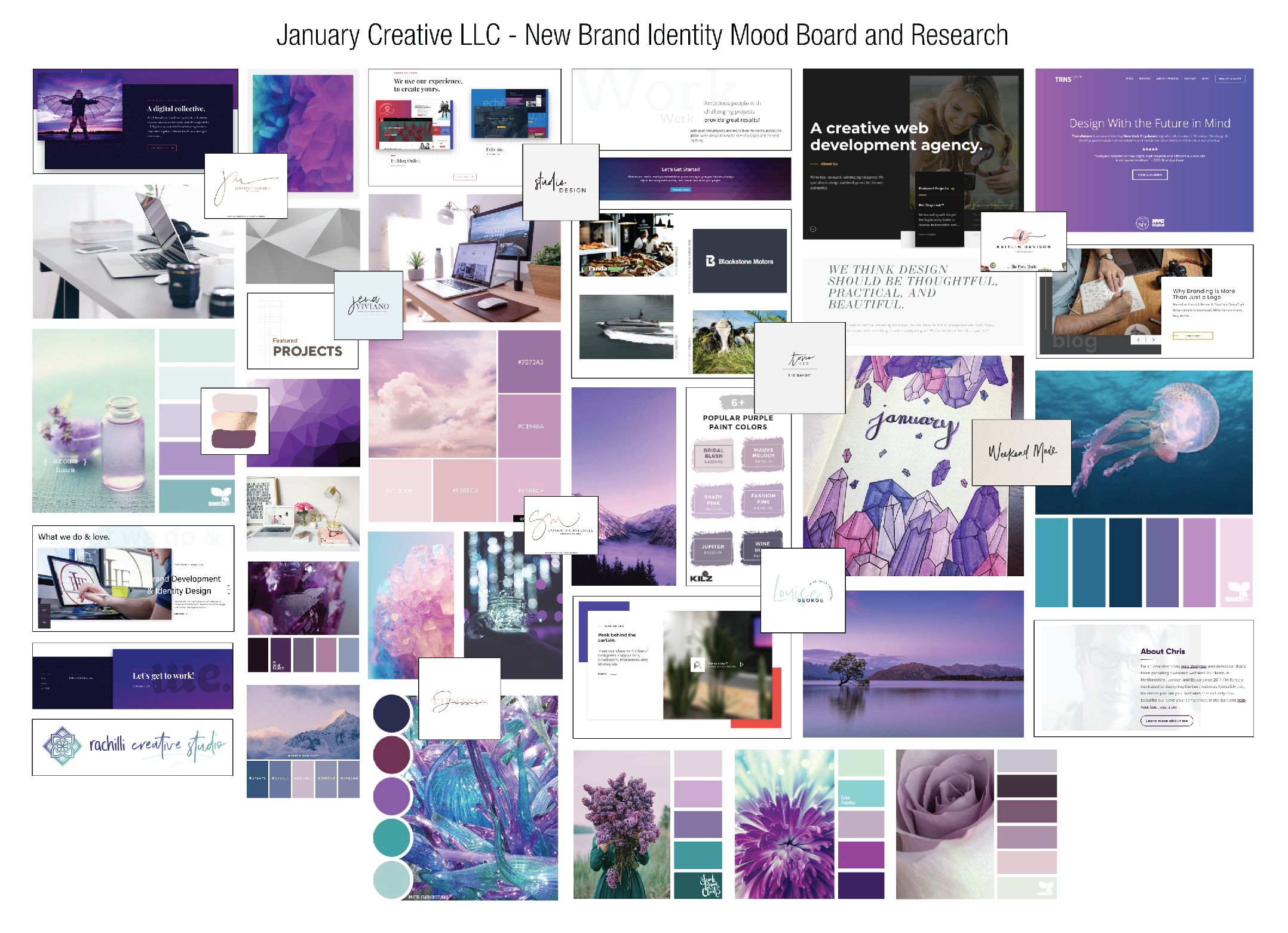
Hindsight is always 20/20, but I'm sure you can see there are a lot of similarities and inspiration from my mood board that can be seen in my new brand identity for January Creative LLC. I focused heavily on using purple as the primary color while exploring the hundreds of different shades, tints, and hues of purple.
I took to Pinterest to look for images that had purple as part of the color scheme to create the mood board. I also explored the possibility of using teal as part of the color scheme as well, but as you can tell I ultimately ended up not using teal in the final brand identity.
Some other images I searched for included logo design inspiration, image styles, and unique design element layouts. Overall, this mood board was instrumental in helping kick off the color + typography exploration and logo design process.
Exploring colors and typography
After I had the mood board pretty much complete enough to work off of (even though I did end up adding to it as the process went along), it was time to start exploring color schemes and typography pairings.
I jumped back and forth between color exploration and typography exploration quite a bit (as you can see in the time-lapse video below). Normally when I was hitting a roadblock or lack of inspiration for one, I moved on to the other, and vice-versa.
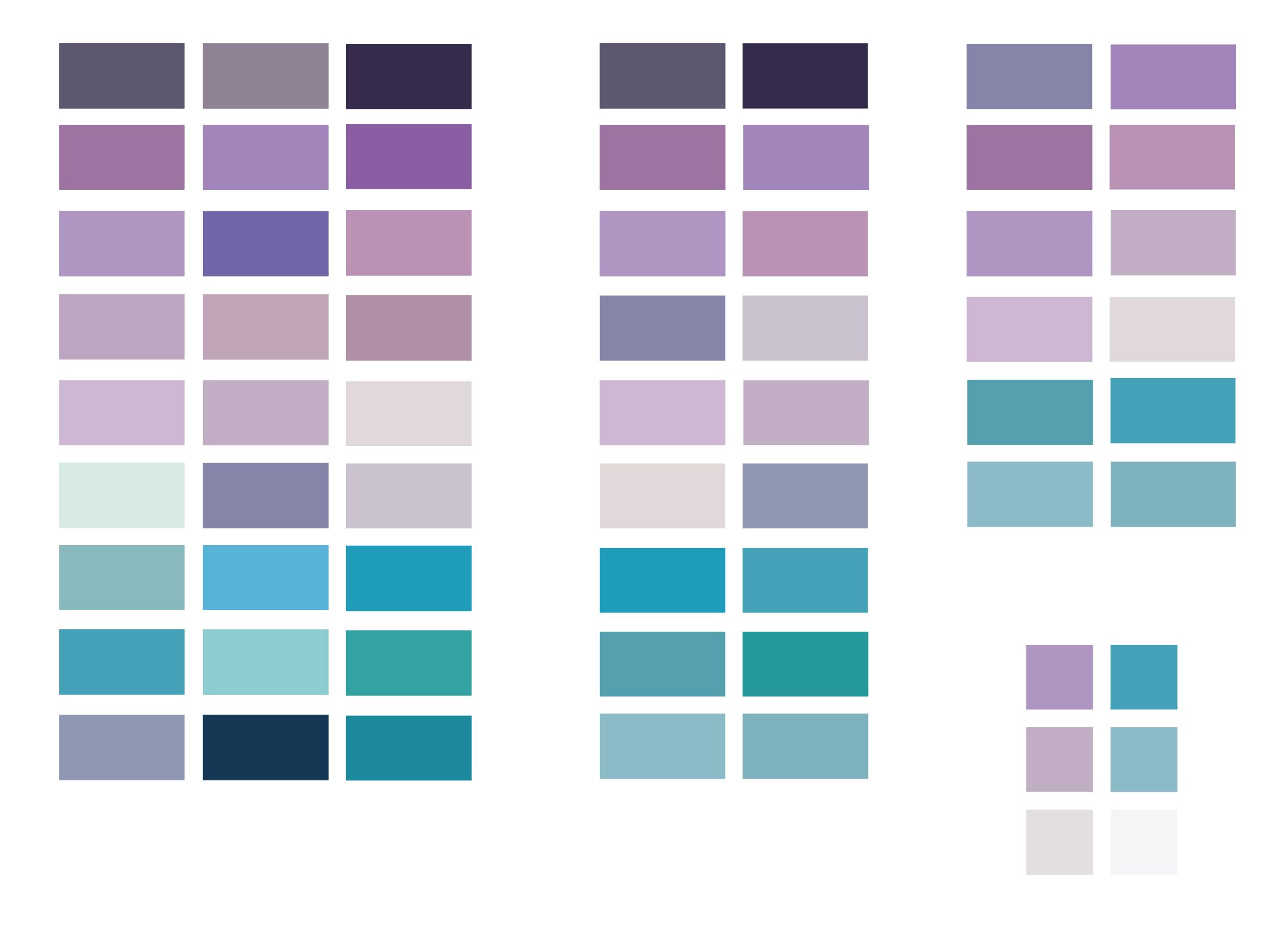
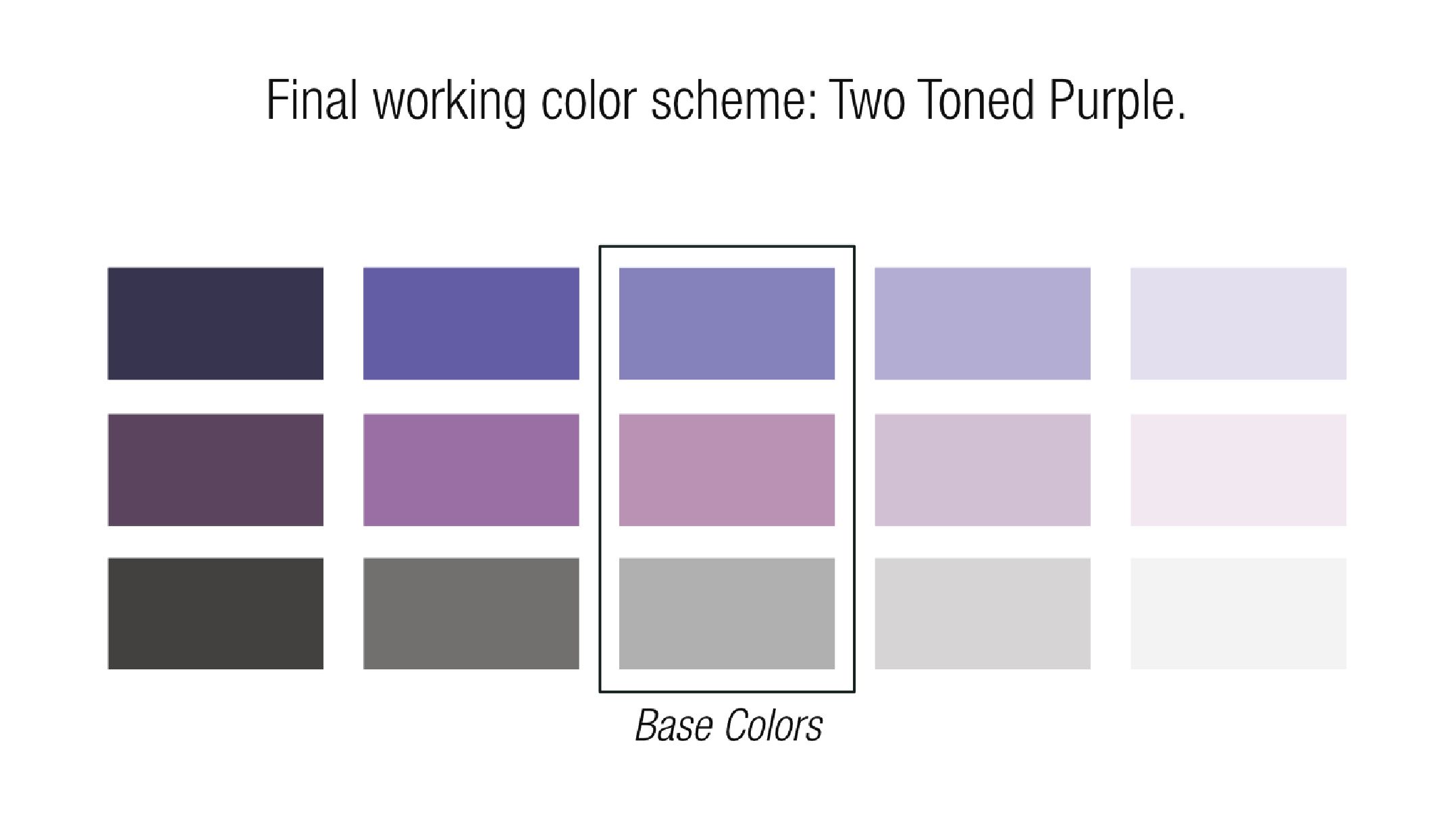
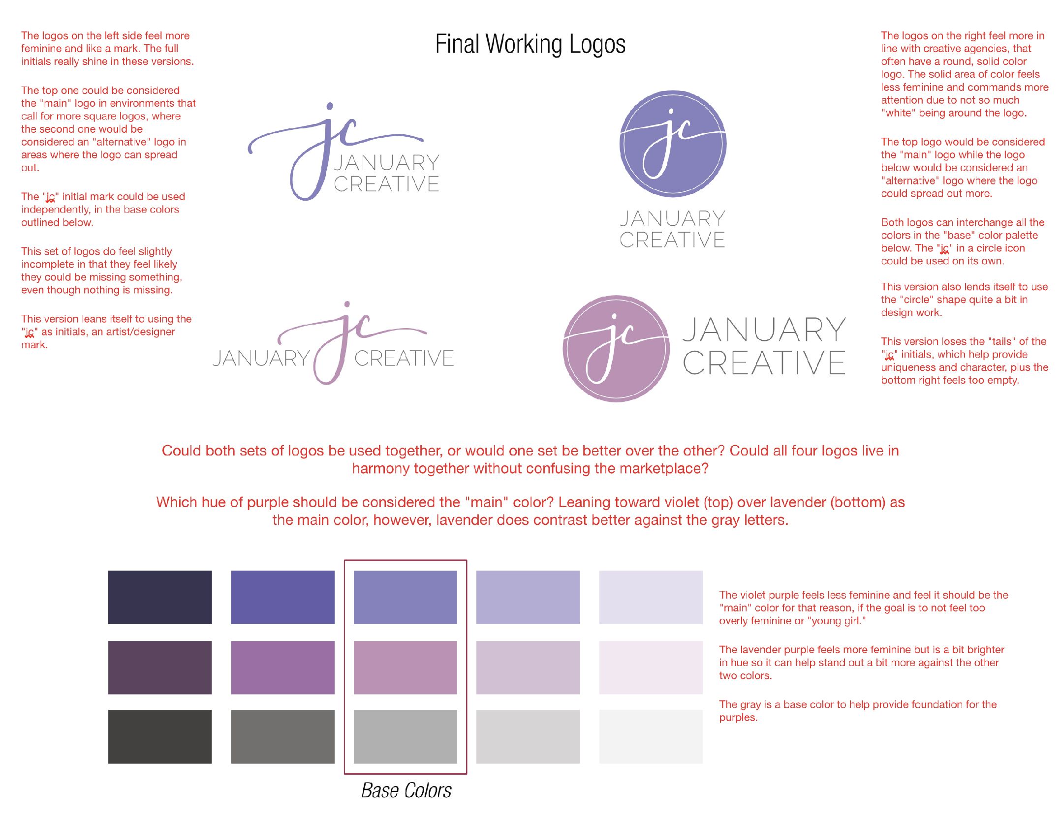
As mentioned above, I was exploring a purple and teal color scheme, but ultimately teal was weeded out of the possible colors. During the process of narrowing down colors, I decided to go with a two-tone purple color scheme: one on the cooler end of the color spectrum (a blueish violet) and one on the warmer side of the spectrum (a pinkish lavender).
Typography was a bit harder to nail down. I wanted a scripted typeface that wasn't overly feminine but still very sophisticated in nature while easy to read quickly. I went through every single font that I had installed on my computer and that I had purchased to find the right font, but nothing fit right.
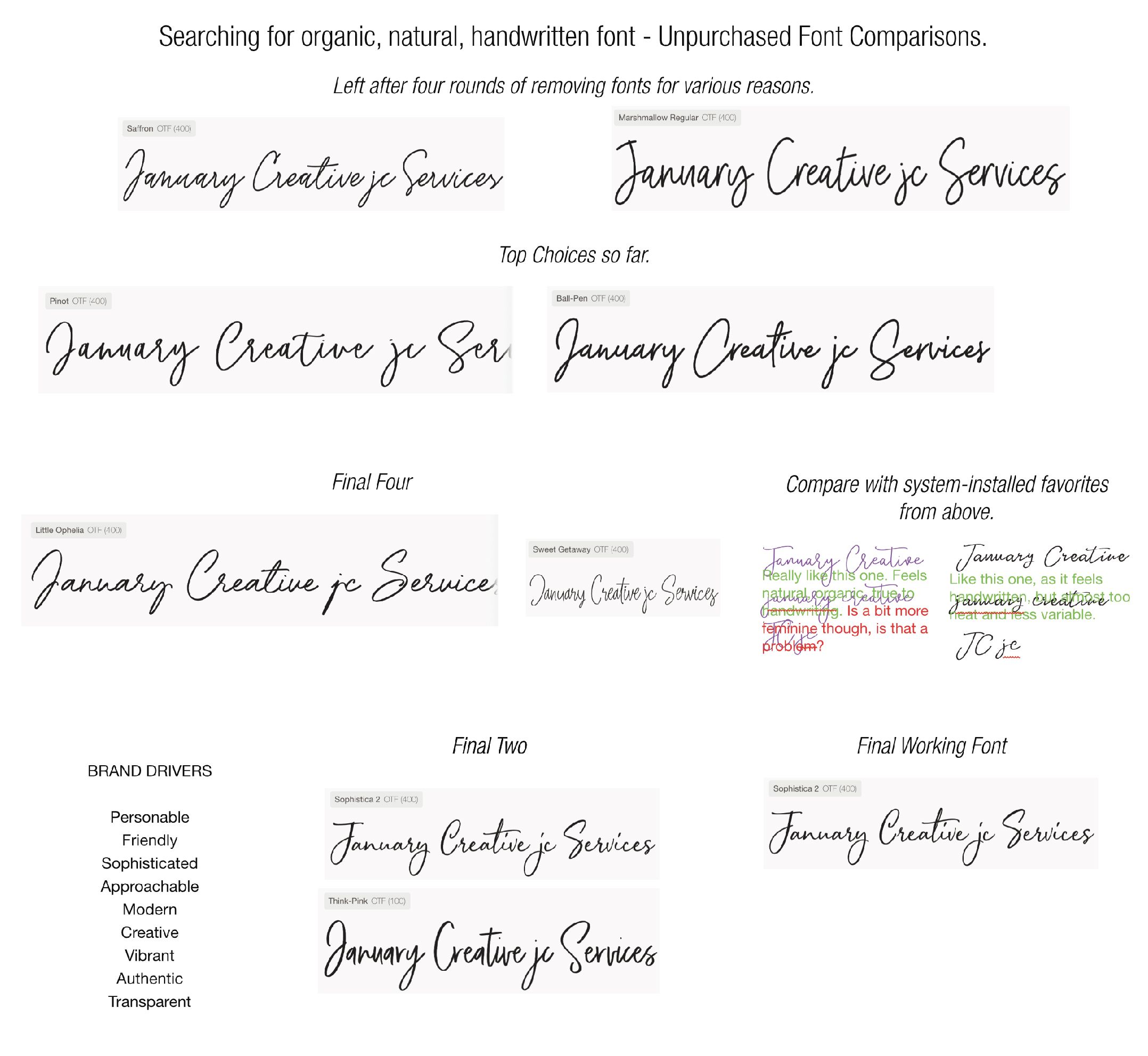
I started looking through a couple of my go-to design resource websites in search for the perfect font. During this phase, any font that could even come close to matching what I wanted was added to my exploration.
After exhausting my resources, I started filtering out the fonts based on different aspects that I felt didn't fit with what I was looking for, such as being too hard to read, too feminine, too rough around the edges, etc. I finally narrowed it down to Sophistica 1 and purchased a commercial license.
With my typography, I knew I needed a secondary font as well (because imagine reading this article in nothing but script! It would be incredibly difficult and taxing to read). The secondary font would be used for body copy (like what you're reading now) and minor headings, while the script font would be used for major headings and small callouts as necessary.
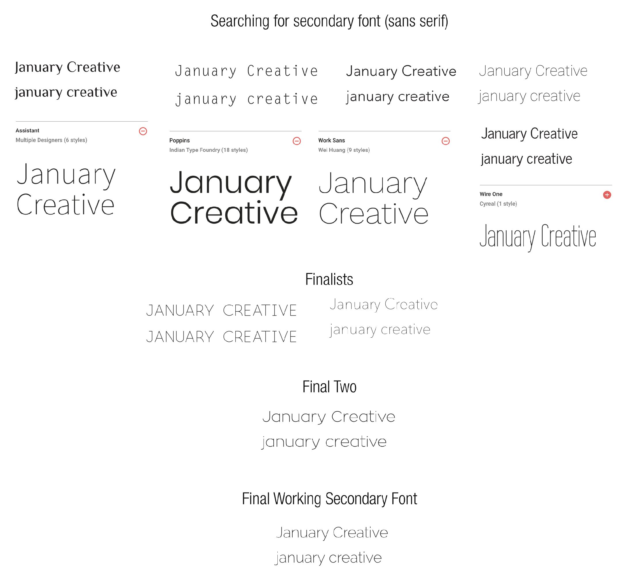
Going through the same process I did with the script font, I searched for, then narrowed down options for the secondary font, ultimately ending with Raleway, a freely available font from Google Fonts. This font paired well with Sophistica and had different variations, making it very versatile. It also worked well with the look and feel of how I wanted my brand identity to look moving forward.
After doing much filtering through the colors and typography, I finally narrowed down to a working color scheme and font (as seen above). This was half the process though, as now I needed to work with the new color scheme and fonts to create a new logo design.
Working on the initial logo design concepts
With the final working color scheme and font choices ready to go, it was time to start working on the initial logo design concepts. There were a couple of directions that I wanted to explore, so I immediately worked on those.
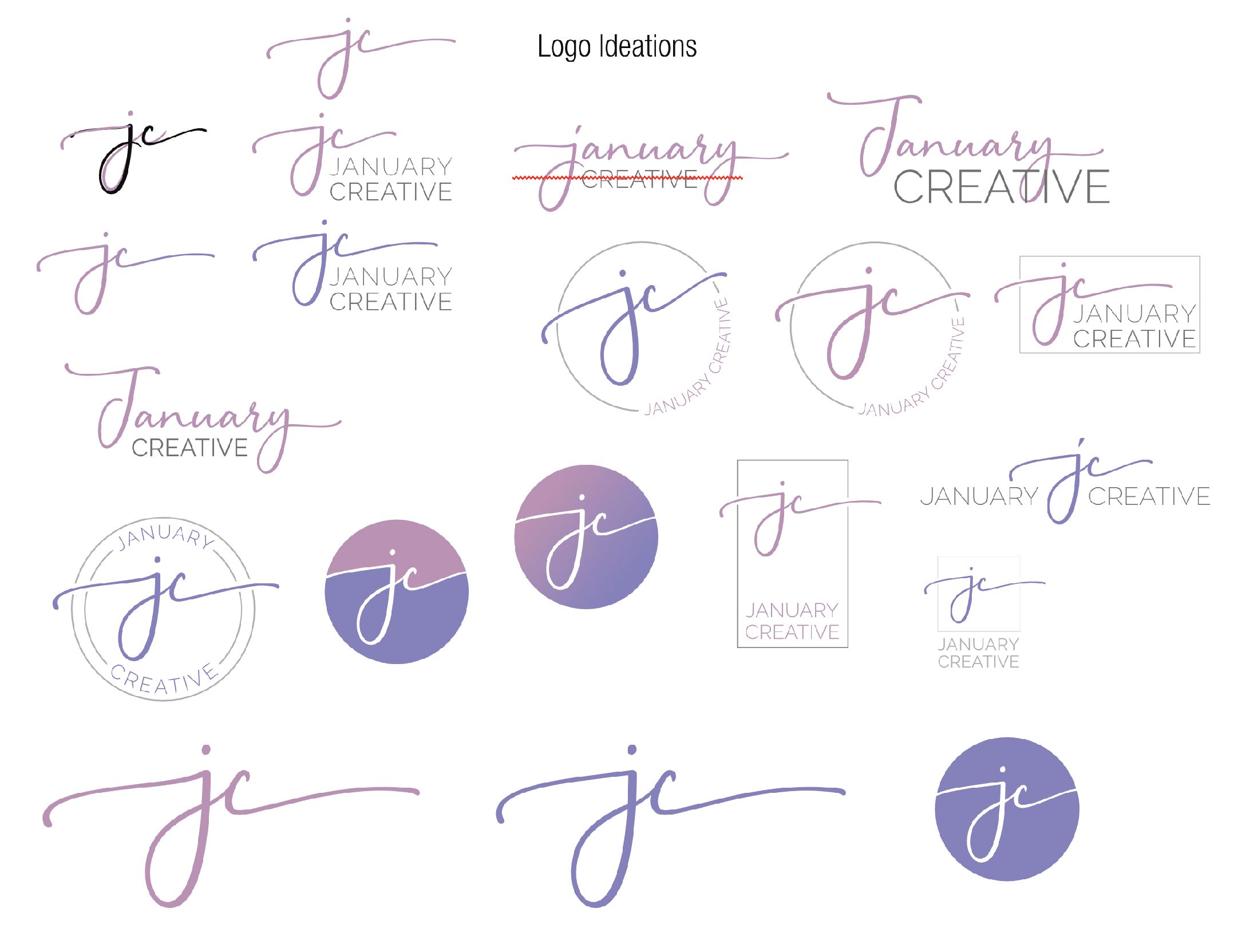
The first concept was about using the initials that I commonly use in my business life: "JC." When I'm working on anything to do with January Creative, I often abbreviate it with "JC" on things like file names, to do items, etc. Not only did I want to use the initials for the new logo, but it was also something that I was using in my old logo. The two parts of the symbol in my old logo were positioned just right to be a "J" and a "C," so I wanted to honor that in the new logo if I could.
Secondly, I knew I wanted some type of mark that made it look like a signature mark, similar to an artist mark. That is one main reason why I wanted to work with a scripted font, to make this signature mark more possible.
Combining the initials with a signature mark using the new font was where I started first. I combined a lowercase "j" and "c" to start getting the initial mark just right. This took some time, as you see in the video, where I combined the two letters then heavily started working with the curves and lines to make it uniquely mine.
When I felt comfortable with this mark, it was time to use this mark in ways that could end up as the final logo design. I experimented with placement of the mark and then with shapes around the mark. This produced some interesting concepts, but ultimately none of them fit quite right.
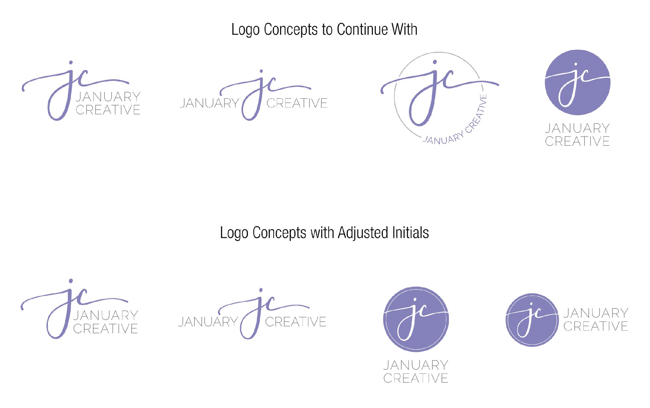
That's when the circle logo concept was born. The thought of a circle logo was not only intriguing but also desired a bit, as it felt like it could be used a "stamp" or "avatar." I tried several variations of a circle logo before I settled in on a solid circle with a small inset white line, with a white initial mark on the inside.
The image above shows a screenshot from my working document that showed the four final logos I was working with and moving forward with.
Was I done at this point? Not exactly.
I actually kept going, even though I ended coming back to this design in the end with minor tweaks. I kept going because I wanted to push my creativity and to see what else I could come up with.
Going past the final logo design
Plot twist! During the entire design process, I did end up going past what would become the final logo design. Why, do you ask? Did I not know at the time that I had the final logo design already? Did I try to do something else and just decide that one that I already had was good enough?
Neither of those is true. Actually, I was pretty sold on the logo design that you see today. Well, sorta. You see, I liked both the circle logo and the scripted initial logo, and had a hard time picking between the two.
Plus, I wanted to push my creativity further to see if I could discover something even more unique.
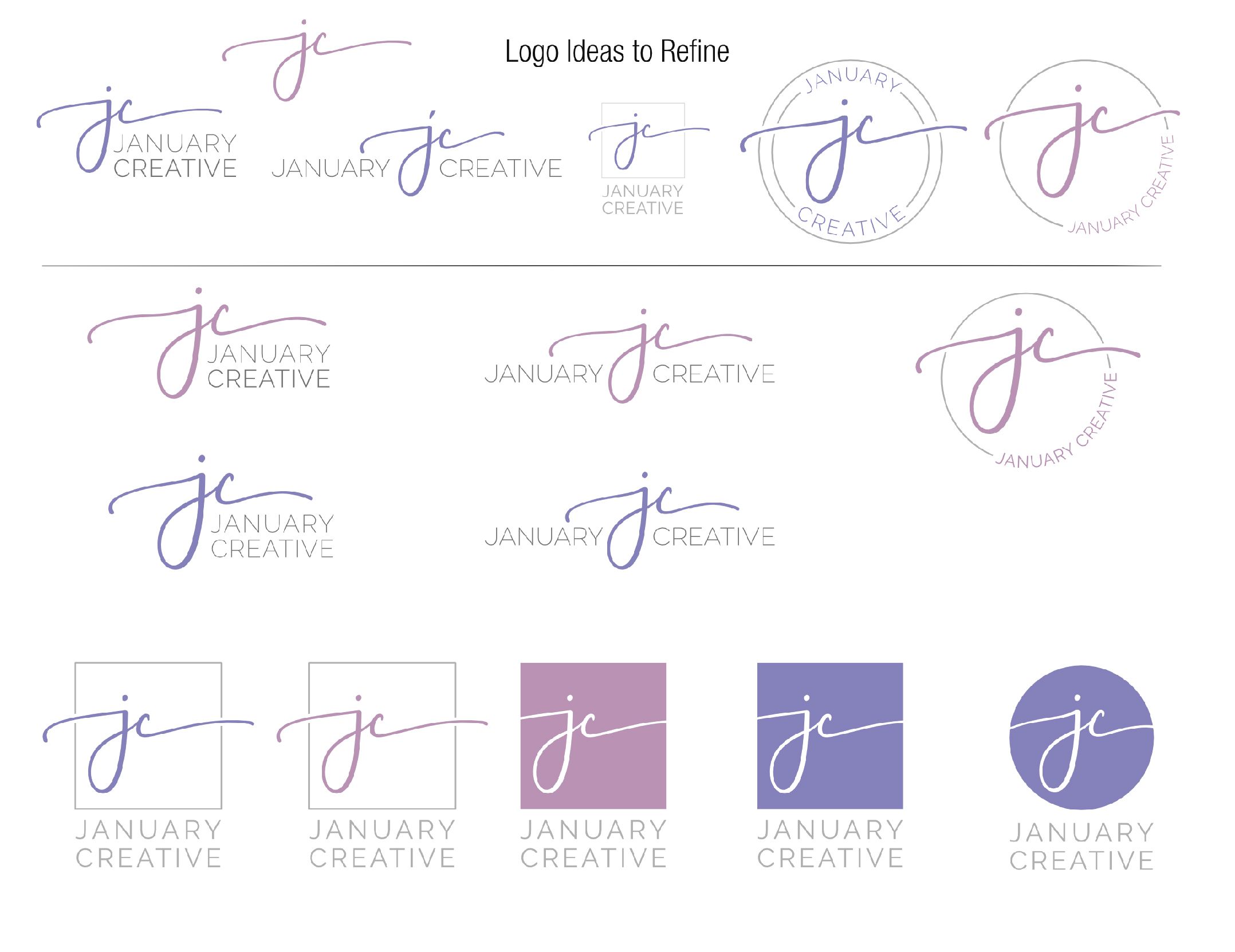
Since you know how this story ends, let me explain how I got there. I was torn between the circle logo and the scripted logo but was favoring the circle logo more. So, while I felt pretty confident in that design, I wanted to see what would happen if I kept pushing it. I wanted to see if something new would come out of it that made me even more excited than the circle logo.
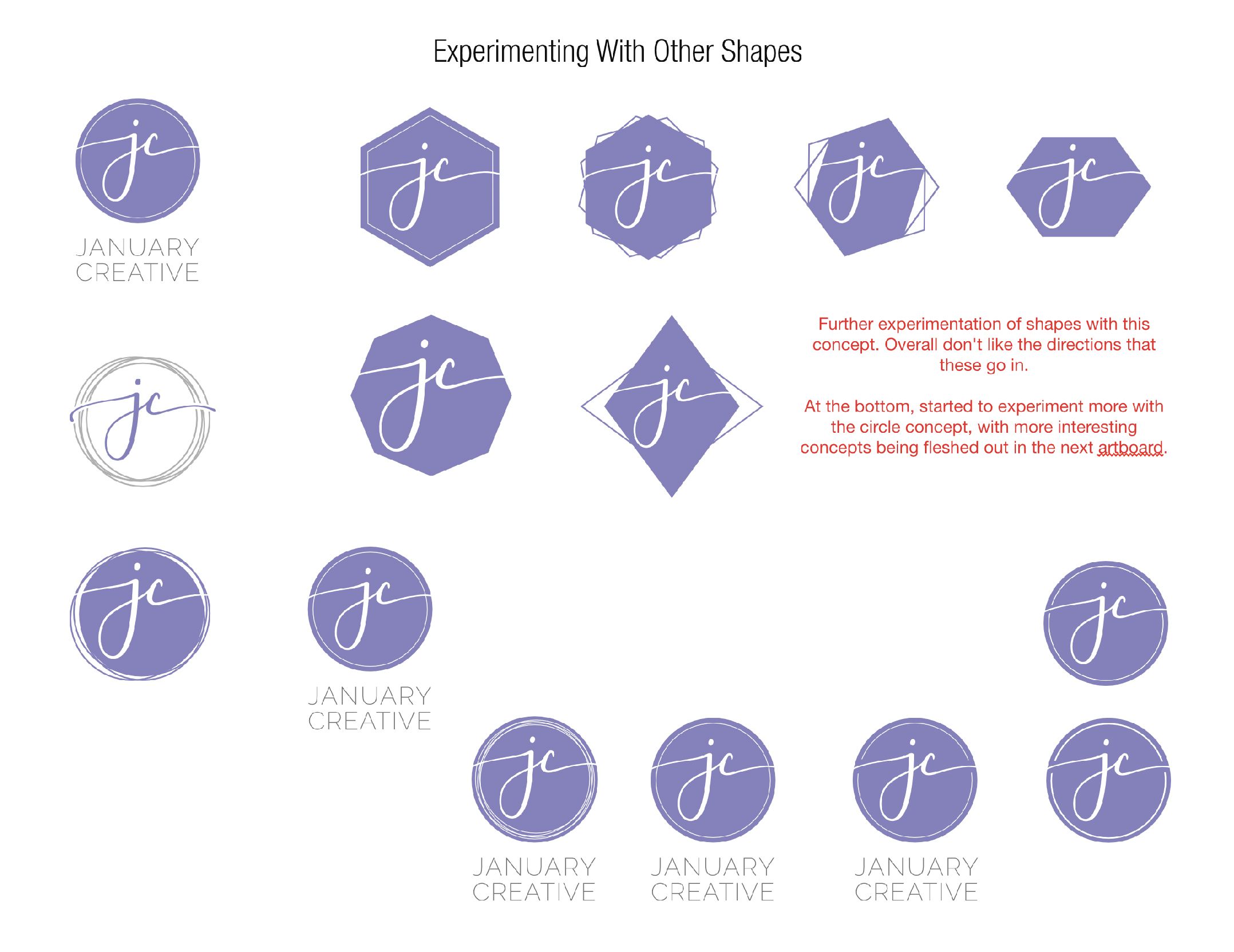
Thus, I started experimenting with different shapes other than a circle, and started working more with the circle concept as well. Diamonds, variable-sided shapes, lines, etc. all were tried to see what I could experiment with and come up with. However, I was still drawn to the circle concept.
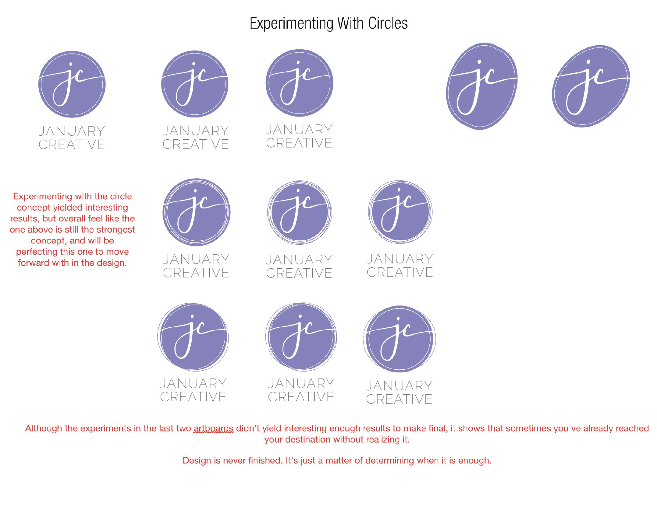
So I experimented more with the circle concept and working to see what could come of that as well. I worked with changing the shape of the circle to make it feel more fluid and organic. I worked with adding more lines inside and outside the circle.
I experimented in every way I could to see what interesting concepts I could come up with and to see if a new logo would happen.
It did not happen.
While these experiments produced interesting concepts, I just didn't feel as excited and confident in those directions as I did the circle design. So, therefore, I went back to the circle concept as my logo design, only slightly modified. I was still torn between the circle logo and the scripted initials logo and was having a hard time deciding. I knew if I was having this much of a hard time deciding which logo to select, then that meant both were viable options.
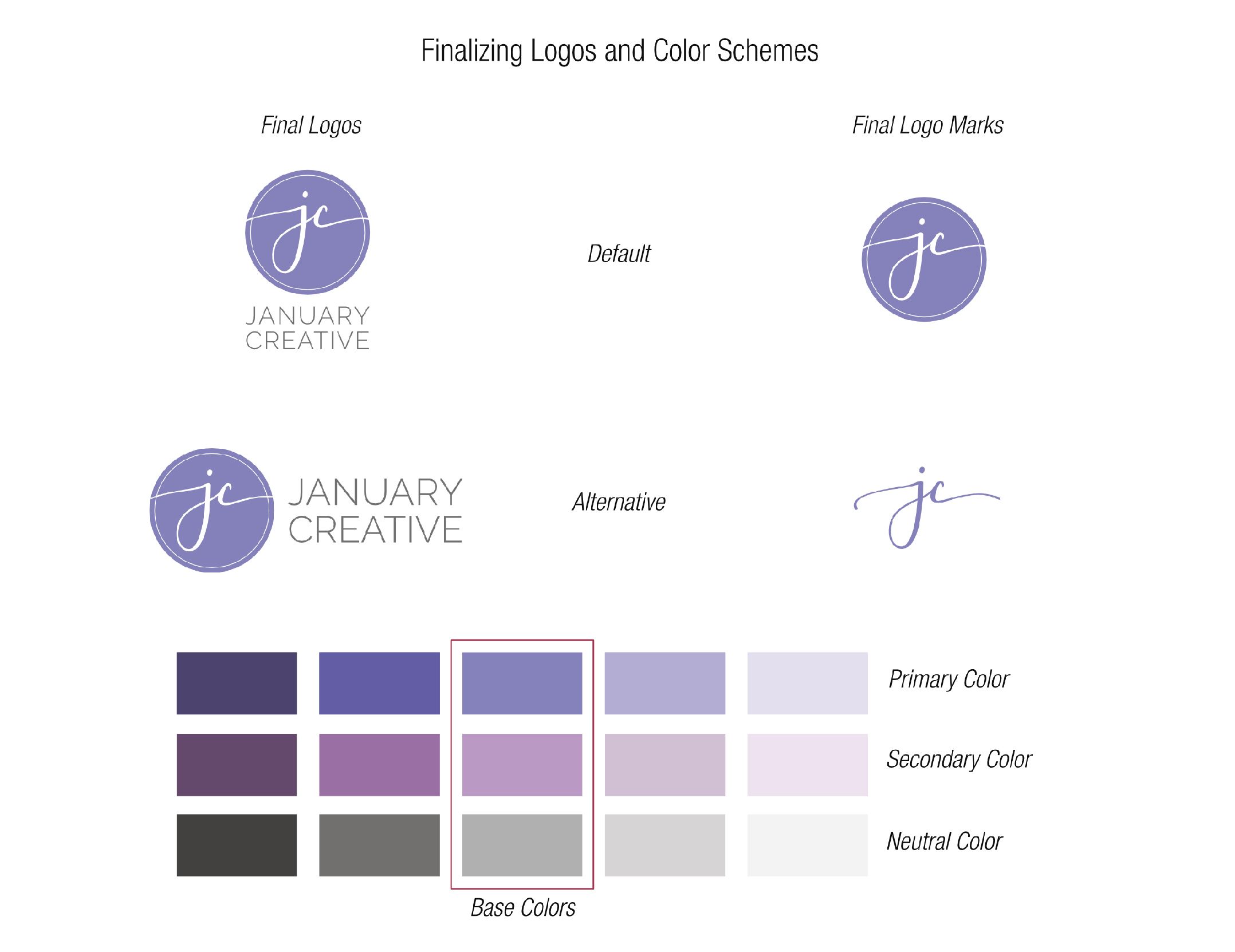
Therefore, after minor modifications, I decided to use both logo concepts, with the circle logo being the primary logo and the scripted initial logo as a "secondary" or "alternative" logo that can be used in certain instances to compliment the primary circle logo.
While working through this process, the original logo design concepts started to feel more and more in line with what I wanted. The more I went back to them, the more they felt right. Which means that they were right all along, even though I needed that time to explore and create to see what else could happen.
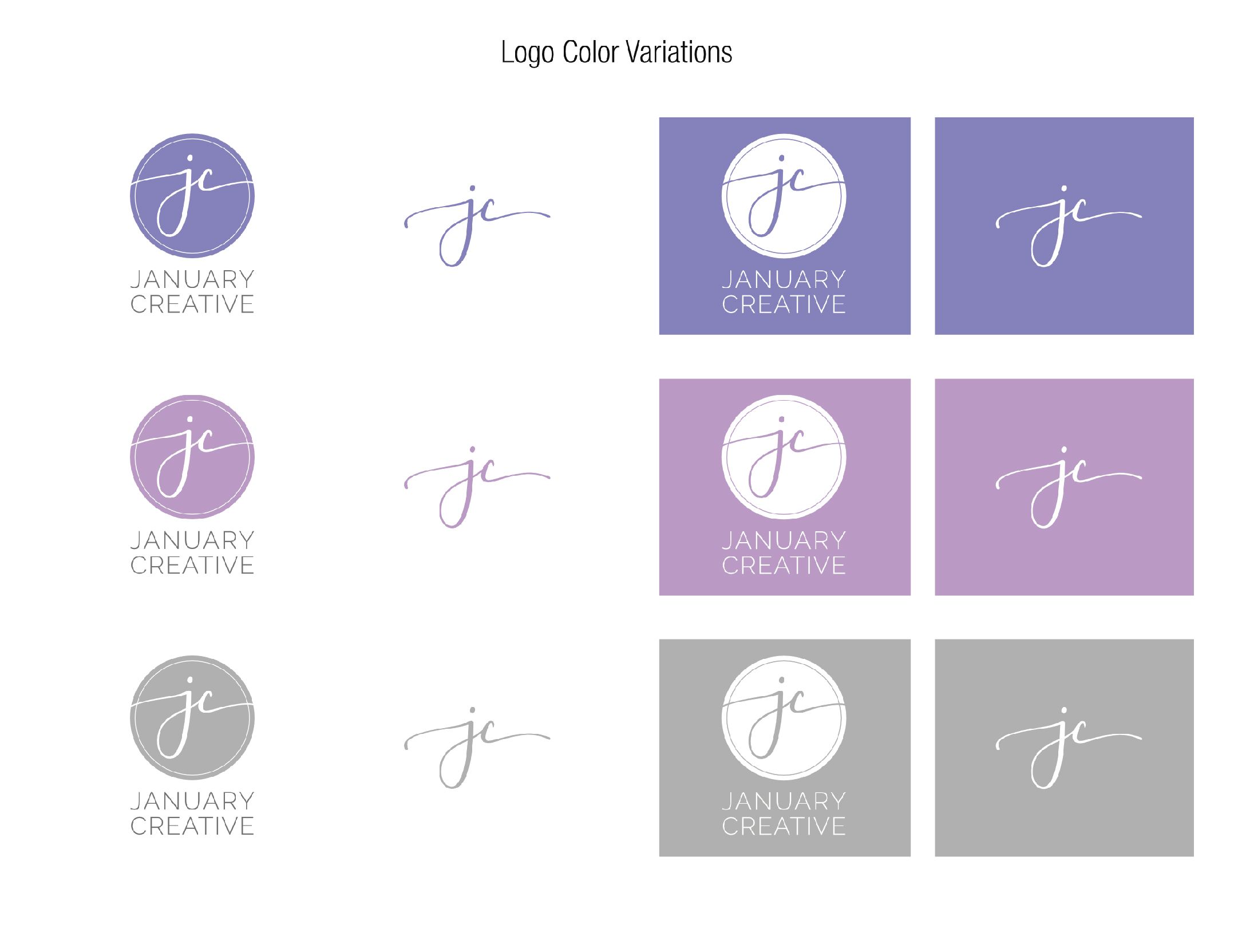
I took the final logo design marks (the circle one and the scripted initials one) and worked with my color scheme to make sure they were the right ones. Sure enough, the more I worked with the color scheme and the logos, the more I knew this was the right logo to move forward with for the new January Creative LLC brand identity.
Time-lapse video of the logo design process
Design is a very visual process, and to fully understand it, it helps to see it happen. And I did exactly that for you. I screen recorded every step in the color + typography exploration and logo design process and created this time-lapse video for you!
Let me take you behind the scenes and show you the time-lapsed version of the color + typography exploration and logo design process that it took to rebrand my design firm January Creative LLC. The video below has an introduction followed by the time-lapse. Feel free to speed it up or slow it down using the function in the bottom right-hand corner to make the time-lapse faster or slower depending on what you want to see.
The color + typography exploration and logo design process you see above took roughly 12 hours. I had done some initial research and mood board creation right before screen recording the logo design process. The research and mood board process took about three hours (that I kept track of), plus I added more to the mood board throughout the color + typography exploration and logo design process.
Tomorrow, I'll keep the curtain peeled back to show you the behind the scenes of the web design process for January Creative LLC's new website, including where I screen-recorded that process as well!